Pricing Page Headline Copy that Works: Examples & Tips
Master the art of pricing page headlines: Blend clarity, value, and reassurance to boost conversions with real-world examples and actionable tips.

Nov 26, 2024
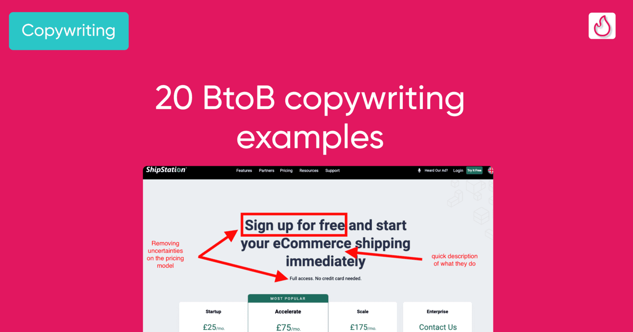
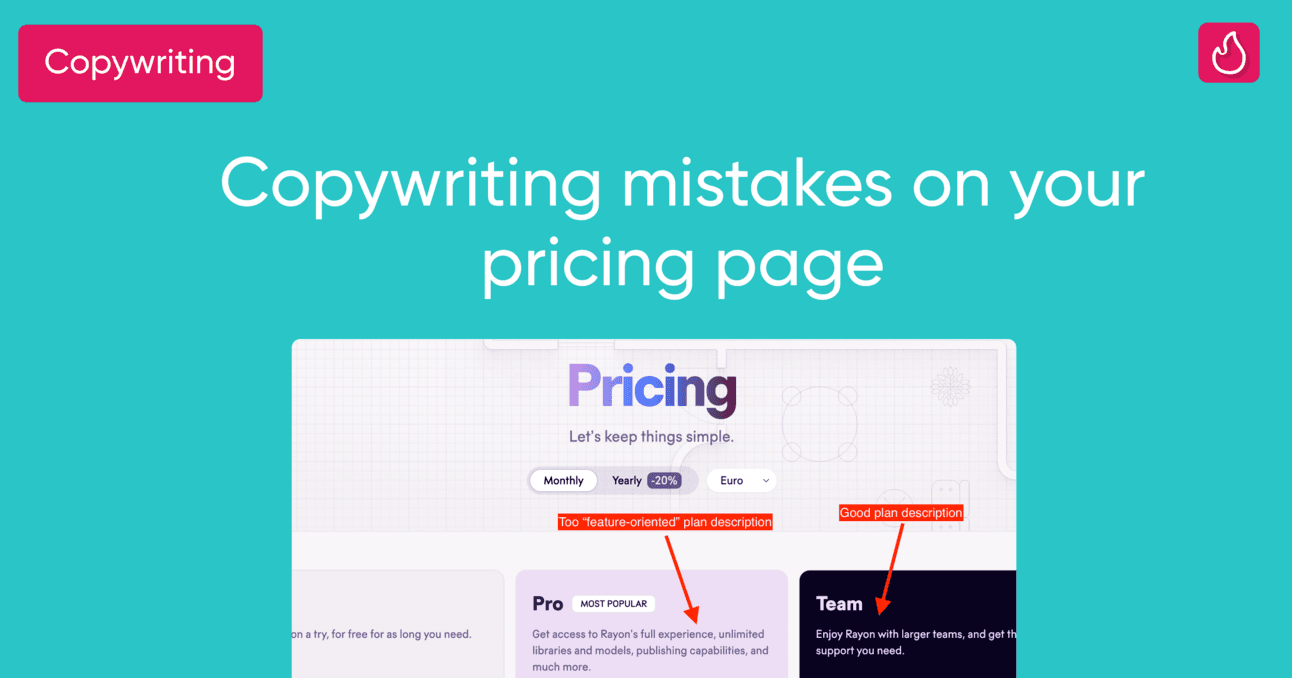
A generic headline is a common mistake on pricing pages.
Your pricing page is typically the second most visited page on your site, yet many still use bland headlines like “Pricing,” “Choose your plan,” or “Find the right plan for your team.”
Since the headline is the first thing visitors see, it’s a missed opportunity not to make it more impactful.
Let’s figure out in the following paragraphs how to write a headline leveraging concrete examples.
How to properly formulate the headline of a pricing page?
Crafting an effective headline for a pricing page is more challenging than it seems. A great headline should communicate two key elements:
Your Value Proposition or a Key Product Feature:
Your homepage likely outlines your value proposition, but prospects may not have fully grasped it. Reinforce it here in a fresh, concise way to boost clarity and impact. Use specific figures or KPIs to make it more compelling. Alternatively, highlight a key product feature that supports your value proposition effectively.
A Reassuring Element of Your Pricing Model:
Include hints that ease concerns or highlight benefits, such as mentioning a free trial, freemium plan, or flexible pricing. For example, phrases like “Flexible with your team size” or “Adapts to your team size” signal a license-based model, providing clarity without overloading with details.
To blend these elements, consider using both a headline and a sub-headline. Balance the two components across them rather than assigning one to each. This approach lets you deliver a clear, impactful message while keeping the design clean and informative.
Stay concise, so use no more than 50 characters for the headline, and no more than 100 characters for the sub-headline.
5 examples of nicely executed pricing pages
Leadpages: “the good student”

Leadpages’s pricing page
Leadpages sets the benchmark for a perfect headline, in my opinion.
Their headline clearly communicates the product's value proposition: “Optimized” landing pages to generate “more leads.” It’s concise and impactful—I instantly understand the product’s promise and the potential return on investment.
They also emphasize the free trial, which is a smart move. If you offer a free plan or trial, highlighting it in both the headline and subheadline—even with repetition—is often effective. Leadpages nails this approach.
My only critique? The phrase “Choose your plan” above the headline feels redundant, as the subheadline already says “Select your plan to get started.”
Perspective.co: “Please try me for free”

Perspective’s pricing page
Perspective does a great job emphasizing their 14-day free trial. They’re right to do so, founders often overlook the importance of highlighting a free trial, despite its potential to significantly boost pricing page conversion rates.
However, the heavy focus on the free trial slightly overshadows the value proposition. While it’s mentioned, it feels somewhat buried compared to the emphasis on pricing reassurance.
That said, the overall formulation is strong and effective.
Memberstack: the great value prop

Memberstack's pricing page
Memberstack does a fantastic job of showcasing their value proposition by directly emphasizing how much users can save with their tool. This powerful message is front and center in their headline, immediately grabbing attention.
They further reinforce this value proposition by highlighting key features that support it. For example, enabling logins and Stripe payments without needing developers perfectly illustrates the cost-saving benefits. Impressively, they convey this value without even showing the product.
However, they miss an opportunity to provide more reassurance to prospects. Important details like starting without a credit card or their 30-day money-back guarantee are left out. These are reassuring elements I’d expect to see, especially in place of the rather vague “Launch today.”
Qovery: concise yet effective copy
Qovery’s headline is highly effective from a copywriting perspective.
It succinctly communicates their value proposition alongside a reassuring element of their pricing model. They also subtly hint at the pricing structure—phrases like “Grow with us,” “Adapt to your size,” or “Flexible with your team size” strongly suggest a user-based pricing model, which is indeed the case here.
That said, the headline could be improved by mentioning a key feature that directly supports the value proposition “Ship fast.” This would better illustrate and reinforce the claim.
Additionally, the font choice for the headline and subheadline could be revisited for better readability. The value proposition currently appears in a tag, but it would be more impactful if used as the headline, with “Start free, then grow with us” positioned as the subheadline. This adjustment would improve the visual hierarchy and clarity.

Qovery’s pricing page
Surfe.co: the “one-of-a-kind”
As a final example, I want to highlight an outlier with a unique approach to their headline. Instead of the usual format, they use a customer quote showcasing the ROI of their product. This effectively communicates the value proposition while leveraging social proof to make it more compelling. I find this strategy very effective.
However, they miss an opportunity to mention key details about their pricing model, such as the option to start for free. Including this information would add an extra layer of appeal and reassurance.
That said, this approach is an excellent source of inspiration—especially if you struggle to articulate your value proposition or want to amplify its impact with social proof.


